Thursday, October 29, 2009

Hope you can come out to play soon!

My dog is absolutely depressed! She's not sick...she's just bummed. Her best friend and next door neighbour, Butzi, has been out of commission for months because of a muscle injury in her back legs. Butzi is a boxweiller (just discovered that term for a boxer/rottie cross) and is an absolutely gorgeous dog. She had surgery at Guelph University, a well known veterinarian school, just this week and I don't yet know how it went. I made this card for her and her humans:


I started with my MFT Gone to the Dogs! set, but there wasn't really one that suited my lovable mutt Phoenix and I wanted her to face Butzi. So...I made my own Phoenix in Illustrator and printed on Gina K pure luxury 120lb cardstock. I stamped Butzi in Memento tuxedo black but removed the tail with a wet wipe before stamping, then drew in her stubbie with a copic pen. To make her 'cone of shame,' I cut out a half wedge of vellum paper with my circular Coluzzle template, sliced the focal image above and below Butzi's head and inserted the cone. Although fuzzy, this picture gives the idea...

While I was stitching around the panels, I thought Butzi needed some pink stitches too. Hope you can see them! She's also brindle just in case you thought my copic colouring was worse than usual...lol!

Thanks for stopping by!
~Nancy

Monday, October 26, 2009

Viva la Verve! October Week 4 {10/24/09} turned out to be a straight sketch challenge with no twist. My Whimsical Wishes (Taylored Expressions) stamps needed some love, so I reached for Spooky Expressions to fill the circles in the sketch. I also heat embossed my images for a change. The paper is from a Recollections pad from Michael's and the spidey brads came in the Spooky Expressions bundle from Taylored Expressions. Colouring with copics, sponging, thread...but it wasn't until I sewed the contrasting zig-zag stitching that the card looked complete. Sorry the photo tonight didn't turn out better. The orange and sponging should look more orange...


a colour twist

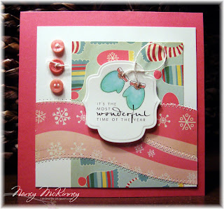
The twist for the Viva la Verve! October Week 2 {10/9/09} challenge was to avoid orange and brown so I stuck with the Golly by Jolly papers and printed the Verve digi image (available as a freebie last week) in black so I wouldn't be tempted! I used the wrong paper for copics so they bled-I'm telling myself that my mittens are just fuzzy and more cozy this way. What I do like is the same PTI rustic thread I used on the buttons as string for the mittens and the pink rolling hills in place of the horizontal panel.

A twist of shabby

The twist for Viva la Verve! October Week 1 {10/2/09} challenge was to take this sketch and go a little shabby with sponging, edge roughing, sewing, light, delicate colors,...

I needed a 'get well' card for a close friend's mother and a more muted look seemed perfect. Sorry I can't remember the name of the paper-it's lovely with an almost modern Toile de Jouy pattern.


fabric friend

Today I'm playing along with Viva la Verve! October Week 3 {10/16/09} over on Splitcoast and plan to catch up on the other three challenges this week. The twist to the sketch was to use fabric, real or faux, on our cards. Since my recent manly kilt was both faux and fur, I thought I'd raid my Amy Butler (there's that name again) fabric stash. I think this is the first time I've used my SU simple friendships set. The mauve/pink colour in the fabric is hard to pinpoint but I stamped the butterfly on PTI lavender moon and matted the fabric and focal piece with Gina K pure luxury chocolate and PTI aqua mist. The ribbon is actually Martha Stewart 1/2" craft seam binding in pink sand. Instead of using the three embellishments in the sketch, I added Bella baubles to the corners on the focal panel. I was going to add them to the scalloped border too but enough is enough...
Thanks for looking!
~Nancy

Sunday, October 25, 2009

Love a man in a kilt!

This week's Unity Bro Challenge #6 was to use ONLY pink and brown (a sweet theme but manly) together with Unity stamps. I searched the internet for manly men in pink for inspiration and found this:


Gerard Butler in a kilt and pink. I certainly think he fits the sweet theme! And Scottish too, so I ran with it and created this card:


The only thing Sir Hot was missing was his sporran, so I used my Unity Vicious Circle stamp to create one, cut out the centre with my Coluzzle circle template to reveal luscious fur (don't worry, it's faux-no animal was harmed in making this card) and made the base and flap with nestie 'labels four' in two sizes. I also embossed the flap with one of the folders from the Cuttlebug Fancy Corners Embossing Set before adding a Celtic-looking button and tassel with a bead I picked up a Michael's. To create the faux leather look, I sponged SU close to cocoa cardstock with Tim Holtz Distress Ink in walnut and tea dye, them crumpled the paper up in a ball and carefully unraveled it. To create my manly kilt (don't you love a man in a kilt?), I folded the paper in a type of slanted accordion fold, then stitched along the pleats.

Even though my name is McKinney, I'm really a Ferguson, which means my sentiment had to be Scottish (hmmm, just like Gerard Butler). In Scots Gaelic, Slàinte Mhath apparently means 'Good Health' and I added the English sentiment so it makes sense to the non-Gaelic. I used Aon Cari Celtic and Adobe Garamond Pro fonts to create my sentiment and printed on retired SU pink pirouette cardstock.

Just one more picture because I'm not sure which gives the best detail...


Slàinte Mhath (may we all see a hottie in a kilt soon)...
~Nancy

Friday, October 23, 2009

VERVE Release Week Challenges

Henri was home sick today--the day I planned on actually creating FIVE cards to play along with the Verve Release Week Challenge. I thought the deadline was 5pm today but I've got to call it quits. We were given five fabulous sketches and a free digi download. What fun!

With just a few hours I managed to get three of the five done and used these sketches:


I used the digi mittens and sentiment for Sketch VSOCT09C:


The paper is S.E.I. paired with retired SU soft sky and ribbon. I played a little with the sketch, so I hope it works.

For Sketch VSOCT09D, I used another digi image but this time by the talented Mo J. Manning at Digital Pencil Too.


When I saw this Sheep on hills image, I couldn't resist. It reminds me of our trip to Scotland and Wales when I was a kid and the sheep that wouldn't move even when the tide came in--they were stuck on those hills until tide change. This is also one of two cards I did for Dawn McVey's Raspberry Suite Color Challenge #18 this week. I paper pieced the hills using PTI New Leaf cardstock and coloured the flowers and image with copics. Love this sketch and colour combo!

And finally, here's my card for VSOCT09E and also for Dawn's challenge. I've actually stamped the Papertrey stems and sentiment from the Everyday Button Bits...love this set and everything I've seen done with it! I kept it quite simple given my time constraints and punched out flower tops from the patterned paper. I added stitching to complete the look while still keeping it simple.


Thanks so much for looking!
~Nancy

Thursday, October 22, 2009

This week's winner!

Check this out ---->
Wow! I'm thrilled!! Thanks, Bro, and for everyone who took a peek. If you missed it...check out my zipper flower (and please let me know you stopped by ;)

Nature Ketto

Here's my card for this week's (or last week's) Bellarific Friday asking for ANYTHING with Nature and also for Beate's Weekend Sketch Challenge #102.


I thought the embossing folder from the cuttlebug cut/emboss combo 'friends forever' set went perfectly with kenya KETTO and her sparkles. To tie the orange and pink together, I sponged Brilliance Rocket Red Gold ink on the embossed panel and the edges of the cream focal image, cut with nesties. My Peony nestie gave the dark chocolate layer just the funkiness required. Inside I've repeated the patterned paper from the Basic Grey Indian Summer collection and kenya KETTO's sparkles.


Thanks for stopping by!

~Nancy

Who's at the door?!

Don't you just love when your project turns out just how you imagined it?! Sometime within the last year I saw an adorable card at a bookstore that had a monster peaking out a top window. I didn't buy the card but tucked away the idea hoping to create my own version. Here it is. The Mojo Monday sketch #109 this week got me thinking together with this recent Halloween decorating idea from Parents.com that landed in my Inbox this week--a feather boa wreath with googly eyes.


I created my monster in the window in Adobe Illustrator, printed on Gina K pure luxury cardstock and coloured with copics after cutting the image piece with my largest Large Labels nestie. I created a wreath form with black cardstock and circle nesties and wrapped these two fibres I've been hoarding around the form. The googly eyes are adhered to the wreath with Aleene's Jewel-It embellishing glue.

To include the Dry Embossing challenge (TSG25) over at There She Goes as well, I embossed the bottom purple panel using my cuttlebug Forest Branches folder. As with most of my cards these days, I finished it all off with stitching.

~Thanks for looking. Let me know that you did!

Saturday, October 17, 2009

Enjoy Your Day

I'm playing along again with Unity's BRO Challenge Week 5. This time we've been asked to bring it home--use something from our HOME that we typically would not use in a papercrafting project and use Unity stamps. I've recently seen some fabulous flowers made with zippers so I thought...hmmm, I've never used a zipper on one of my projects.

The most attractive ones use vintage coloured zippers, which I didn't have...so I used two white zippers (one complete 40cm and one half of a 45cm zipper) I had and coloured the twill with copics in the colours I planned to use on the card. My daughter Morgana thinks it's pretty cool but I can't imagine mass-producing these. My fingers actually hurt from handling the teeth and sewing through the thick layers!! Because the flower is so heavy and is meant to be a brooch, I fastened it to the card with two small silver library clips.


The card itself is simple--I stamped the leafy swirl from April KOTM-fresh beginnings and "enjoy your day!" sentiment from May KOTM-another sweet day; cut the scalloped edge with my EK Success Cutterpede (I'm still searching for the perfect trimmer!); trimmed around the flowers in the Me & My Big Ideas Fashion District paper pad; and zig-zag stitched around the card.


I think the card is pretty enough on its own, but the flower makes a unique little gift. Obviously other people think so too--you can buy a Kate Cusack zipper flower for $85!!! Halvorsons on ETSY are $28. Hmmmm.....


Why not try making one yourself. New York based Annie Mistak has provided the Zipper Flower How-to on Martha Stewart.com.


~Thanks for looking.

Here are my other BRO Challenge entries if you're interested:

Challenge #1-Date night
Challenge #2-skipped it
Challenge #3-Polka dots and plaid
Challenge #4-Sex in a Pan recipe

Monday, October 12, 2009

each day brings beauty...


I used the image I created earlier today but resized it and added a smaller bloom, circular border and the sentiment "each day brings beauty and something to fill your heart with thanks" given it's Thanksgiving here and I truly believe this. I coloured my image with copics--I found a better slice of cardstock--and wow, what a difference. This time if the colouring isn't perfect, I can't blame the paper.


I've also faced something I always suspected...I love square cards! Can't resist making a card square.

Other details: light pink textured cardstock, Bazzill; Indian Summer paper, Basic Grey; dark chocolate pure luxury cardstock, Gina K; grosgrain ribbon and rustic twine, Papertrey Ink; button from an assorted collection...

Big Bloom


Just playing around in Illustrator today and this is what I created. I printed the large bloom on white cardstock--unfortunately I'm out of the good stuff--and coloured with copics then trimmed around the images. To add some sheen to the kraft frame, bloom and cream piece, I sponged with Brillance in Rocket Red Gold. The green patterned paper is from the K&Company Black & Ivory Fushion paper pad (love this collection!). All other cardstock and ribbon is from Papertrey.


~Thanks for looking (please tell me that you did)...

Sex in a Pan

Okay, now that I have your attention...this is my entry this week for the Unity Bachelor Bro Challenge (UBBRO4). We were asked to make a recipe card and include Unity stamps. Bro seems to like his cards hot, so I thought a little sizzle might work.
"The stuff you need" is printed on cardstock and framed in an image from the Simple Life, March Kit of the Month. The 'love foodie in a pan' image next to how "To get it on..." and 'sweet heart' image are both from the Remember Happiness, August Kit of the Month. I chose the American Crafts paper from the Metropolitan collection because of the similar swirly pattern and fun with circles. Lots of stitching and a few Kaiser pearls. What do you think, Bro?

The recipe comes from allrecipes.com. The title font is Holiday Home.

Sunday, October 11, 2009

Birthday Bunions

Happy Thanksgiving! Today we're visiting with my sister and her kids. It's also her birthday. Enough reasons to make her a card, but there's one more. On Thursday she had a bunion removed and she's confined to bedrest/home for 4 weeks.


I thought this MFT Who's That Girl pedi image was perfect. My sister has a regular mani/pedi and always wears her signature red. I'm sure a glass of wine or two will also be part of her recovery and birthday celebration.

I used Beate's Weekend Sketch #101 (WSC101) and rotated it. The image is coloured with a combination of copics and paper piecing for the chair. Seems I've caught the same bug as Jodi and can't let a card go without some stitching.

Thursday, October 8, 2009

Making eyes goggle!

Today I can honestly say I love this card!!


First I loved creating this image for Taylored Expressions. You'll find this flirty, witchy skirt in the Punchy Potions set, part of the Whimsical Wishes line. But really the stamped image on the card came after I started playing around with my new Impressabilities Circles. I embossed using my Cuttlebug on white cardstock and then smeared black ink all over the embossed image. Because I had a Halloween card in mind, the distressed look was perfect. I imagined googly eyes when I was 'eyeing up' this template at the store. Hope you can see them! Some stitching; wonderful mesh ribbon that was included in the Spooky Expressions Bundle from Taylored Expressions; PTI plum pudding and SU kiwi kiss and black cardstock; and a strip of paper from Recollections Halloween 8"x8" paper pad (I think this is a Michael's brand). Finally, I'm also happy with how my copic colouring turned out. This is a fun and easy image to colour (and cut out with Spellbinders ovals).

I should confess that this was supposed to be a purple card but I sewed it shut! "Scary eek scary eek..." Luckily I still had 12"x12" textured kiwi kiss cardstock in my stash.

Thanks for looking...please let me know that you have. ;)

Off-beat circles freebie

Taheerah at fill your paper with the breathings of your heart asked me to post the digi image for my off-beat circles, so here it is in both black and white and in colour (close to the new SU dusty durango).


If you click on the small image, it should go to the larger version, which you can right-click on and save. You could print it and use as is or punch out circles and pop them up. Have some fun...I'd love to see if you've used it so please leave a comment and link back to your stuff. Thanks!

Wednesday, October 7, 2009

Spooky Night

I'm trying hard to create something every day and post more regularly. So, I took the Splitcoast Sketch Challenge 249 (10/07/09) today and this is what I came up with...


I wanted to use Debbie Olson's 'stitched paper landscape' technique (for example) together with the tree from the TE Whimsical Wishes set I designed, Spooky Expressions. I used my BoBunny knife to cut around the base of the tree so that I could include a slope behind and in front of the tree. I highlighted the spider web, spider back design and stars in the sky with white gel pen.

Other details: Doris Castle Designs Little Boo Collection and We R Memory Keepers Black Out double-sided patterned paper; PTI black and summer sun and SU pumpkin pie cardstock; Martha Stewart edge punch; SU whisper white craft ink and clear embossing powder (for a more subtle, finer embossed image)

Tuesday, October 6, 2009

From above

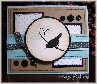
Love this 'perched bird' image by Blackleaf Design at mygraphic.com. I downloaded it for free, then coloured the leaves in Illustrator to match the paper I planned to use before printing on PTI rustic cream cardstock. I followed the sketch for this week's Monday Mojo Madness 107 fairly closely.


The focal image is cut with nesties and sponged with PTI chamomile. The aqua mist, kraft and black cardstock; black vintage buttons; and slice of grosgrain ribbon are also all from Papertrey. The black dotted sheer ribbon is May Arts from Flourishes.

Catch you when you've got the time

I’m going to sneak in another Papertrey WCMD challenge card before the deadline at 7am tomorrow.

Inspired by the signature traits of Australian Aborigines, our project either had to incorporate dotted outlines or masking. I love masking, but not this time…I chose to do dotted outlines and created my own image in Illustrator based on this art. Cool, eh? It reminded me of wheels and time, so I added the sentiment “Catch you when you’ve got the time” on a curve. I used my white gel pen to make dots around the circles after printing the black image on SU cardstock (Looking closely at my photo, I see I have some more dots to fill in and clean up—oops). All other cardstock—rustic cream, kraft and black—are PTI. To add texture I embossed the cream panel and a scrap of black before punching out the circles for the eyelets and rustic thread. I thought the wavy border added another dotted element.
~Thanks for looking…

Please leave me a comment. If you want me to post my 'dotted connected circles' image as a freebie let me know...

Monday, October 5, 2009

Day of the Dead

With the extra time for the Papertrey World Card Making Day challenges, I was able to make one today for WCMD Challenge #2: Mexico. We were asked to get inspired by either the colours, designs or even themes that are prominent in the Mexican culture. I just happened to be jumping around design blogs today and found this free Day of the Dead brush set at mygraphico.com. How perfect!


I went for lots of colour here and mixed more than I usually would in keeping with the vibrancy of Mexican art. After resizing the image in Illustrator and printing on cardstock, I used a blender pen and Polished Pigments (like Pearl Ex) to colour the decorative skull (I still need to use something to fix the colours so excuse any smudging--Henri got to the card before I did with my camera). Because I don't have orange Polished Pigments, I printed a second skull image on SU Pumpkin Pie and paper pieced the feathers. My Impression Obsession order arrived today so I inked up my new Cover-a-Card Tapestry background stamp and stamped on PTI Summer Sunrise. I also layered up with SU Taken with Teal and Pacific Point.

Now I just have to find the right person to give this to!

Sunday, October 4, 2009

Sometimes there are no words

Although I wanted to play along with more of the fabulous challenges posted yesterday on Splitcoast, I've run out of time! Here is my simple card for the WCMD09E -Verve Stamps challenge asking us to pick a flag and make a card using the colors of that flag.

Just a few hours ago, I learned that a friend of my husband's boss (and someone my husband knows well) died suddenly yesterday. I intentionally picked Botswana, which gave me blue, white and black-the colours I wanted for this sympathy card. I used retired SU soft sky cardstock and ribbon and PTI black and rustic white cardstock.


I embossed the soft sky panel with the leafy (name?) Cuttlebug folder, which I actually cut at the top seam so I could place the image where I wanted. To highlight the embossed image, I gently sponged with soft sky classic ink and stitched with black thread around the panel. Sorry that this card doesn't photograph better--it's very soft and understated. The message on the front (done on the computer and printed) says Sometimes there are no words and inside says Our sympathy and understanding is with you. in very light, small print.

You are my polka-dotted and plaid sunshine!

This weeks' Unity Bachelor Challenge (UBBRO3) is all about polka dots and plaid. Eeks...I don't have any plaid background stamps or paper so I made my own in Illustrator and coordinated the stripes to match the SU Pumpkin Pie, Cosmo Cricket paper (looks like SU Wild Wasabi) and chocolate cardstock and papers I used.
The images (pocket, polka-dotted cloud, sentiment and sun) are all from Unity's July KOTM-A pocket full of... and are a combination of paper piecing and colouring with copics. To add more polka dots, I embossed a portion of my image block with a Cuttlebug border template. Wendy, you're right...it just didn't look complete without the stitching.

My colour combo seems to work for Gina K. Designs' World Card Making Day Color Challenge (WCMD09J) since I used SU Pumpkin Pie, SU Very Vanilla and Gina K's Pure Luxury chocolate (so scrumptious!).
Thanks for looking...and because you did, how about a freebie? I'm not sure if this will work, but let's try...

Click on the plaid swatch below to view a larger format. Right-click on the full-size plaid image, choose Save Picture As... and save the .png file where you would normally save your files.


Print your plaid in colour on a neutral cardstock and have some fun!!

Saturday, October 3, 2009

Gotta love a gorgeous bag!

...even if it's a lunch bag. This card is for the Inspiration Challenge 200 ~ Kir DeVries on Splitcoast (IC200). We were asked to check out the wonderful things online at Kir DeVries and find inspiration. I found enough inspiration to keep me stamping for months so I'll let you know when I post another Kir DeVries-inspired project (where did that name come from anyway?). Today it's the Hadaki Lunch Pod in Liquorice that had me. The colour scheme--black, cream and a bronze-brownish colour--texture and simplicity.


I stamped the background (it's not SU's Linen background stamp but something similar) in Antique Linen ink on PTI rustic white cardstock, then stamped my SU pretty petals background in black. The sentiment was done on the computer and then edged in Brillance Coffee Bean and stitched in black thread. Instead of using black cardstock to mat the main panel, I sewed black piping to the edges. I turned the card into a pocket and created the 'purse handle' with oval nestabilities and stitching.


Thanks for looking!